Responsive design
Overview
Template Creator CK allows you to create a responsive design that will adapt to different devices. Click on the Responsive Design button in the top menu.
This will open the left panel edition and add the edition on each block / wrapper / row / column so that you can control anything.
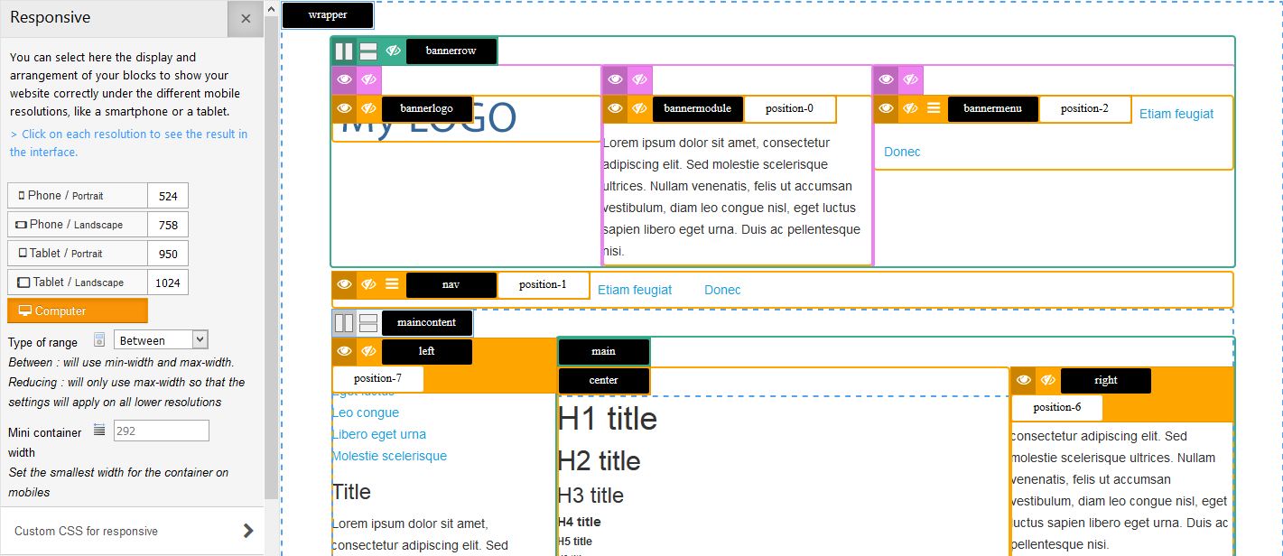
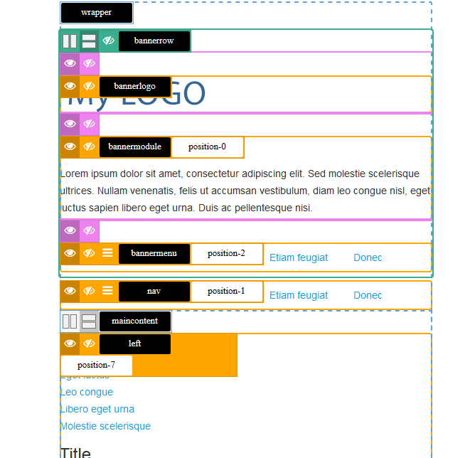
On the left panel you will see the different resolutions / devices for which you can set the blocks behavior. Click on each device to see how your template will react. Example with the Phone / Portrait resolution :
Set your own resolutions
For each device you can define your own value (in px) where it will add a breakpoint in the CSS mediaqueries. By default the system gives some standard values :
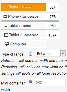
You can change these values to adapt to your needs.
Between or Reducing ? This controls how you want the rules to apply. For example, if you set a row to be stacked vertically on a tablet, do you want the row to be stacked automatically on phones ?
YES : use reducing, the rules will only use the min-width selector and apply to all resolutions under the value
NO : use between, the rules will only apply between the breakpoints, from 950px to 758px for a tablet. The other resolutions will not be impacted by the changes.
Mini container width : this is the smallest container size that is given to your template on a Phone / portrait, if you have selected in the template parameters to be Fixed width design.
Responsive toolbars
On each block you will get a specific toolbar where you can set the behavior :

You can
- align the items horizontally (behavior by default)
- stack the items vertically
- hide the block
On the menus blocks you will get another toolbar :

You can
- show the block (behavior by default)
- hide the block
- show a hamburger icon that shows the menu on click
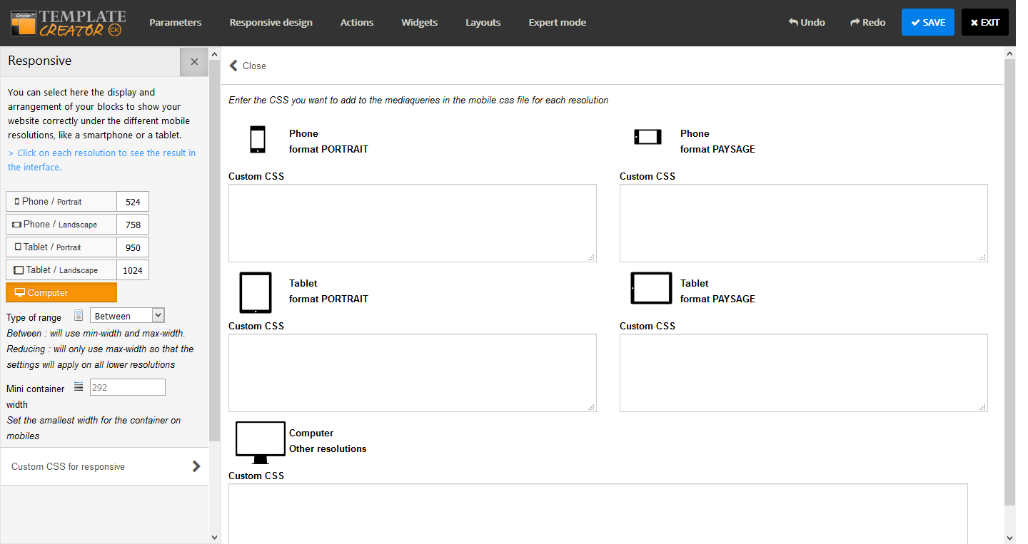
Responsive Custom CSS
In the left panel you can click on the button Custom CSS for responsive that is at the bottom. It will open a popup where you can write your own CSS rules for each resolution.
Responsive specific CSS classes
Template Creator CK helps you to manage any items in your website that you can hide on each resolution. It also adds the css classes to stack vertically the columns that you have create using the Template Creator CK CSS grid. Each class is added in the resolution according to the values that you have set (see above).
CSS Classes to hide the items
.tck-hide-desktop
.tck-hide-tablet-l
.tck-hide-tablet-p
.tck-hide-phone-l
.tck-hide-phone-p
You can use these CSS classes anywhere, into a module / widget, on any html tag in your page, exactly where you want.
CSS Classes to stack the items vertically (when using the Template Creator CK CSS grid)
.tck-stack-desktop
.tck-stack-tablet-l
.tck-stack-tablet-p
.tck-stack-phone-l
.tck-stack-phone-p