

There are some (obscure ?) reasons why Apple would not enable the fixed position for the background images into its operating system for mobiles, called iOS. This occurs if you have an iPad, or an iPhone for example.
What happens ?
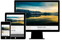
You image will be fixed, giving you a sort of parallax effect, on all browsers and devices excepted on iOS. This means that your website will not look the same.
Where is the problem ?
Fixed or not, this is not a big problem, right ? The problem may come if you want to apply a cover sizing to your image, that is a background of your body or another big area. Explanations :
- the body is the whole page of your website, it has a long height
- setting the image as fixed, will make it stay at the same place in your window / screen
- giving the cover sizing will make your image take the whole area to fill every space so that there is no blank
- all devices excepted iOs : the image is fixed, the cover sizing will then be limited to your screen size and the image will cover it correctly
- iOs : it does not accept the fixed position, then your image will cover the entire area given by the html tag (your body or whatever you have selected). The image will be stretched to cover all this place, it will be totally zoomed in and distorted. This is awful
What is the solution ?
Hopefully the CSS have a solution to limit this problem : you can detect if you are using an iOS device and give a custom css property to deactivate the fixed position and set another sizing method that is more accurate for this situation. All other browsers will be unchanged.
Example of CSS code :
#wrapper {
    background: url('../images/my_image.jpg') center center no-repeat fixed;
    background-size: cover;
}
This will apply the image as background, fixed position with a cover sizing. You can do that simply into Template Creator CK by editing the styles options and set your images and the other options.
To fix the problem on iOs, you can add this code
@supports (-webkit-touch-callout: none) {
#wrapper {
    background: url('../images/my_image.jpg') center top no-repeat scroll;
    background-size: auto 100vh;
}
}
This will detect the device, remove the fixed position and give some custom positioning and size to your image to make it look better especially on Apple devices. You can adapt this code to your needs, and you can paste this into Template Creator CK using the Add some custom CSS feature.