


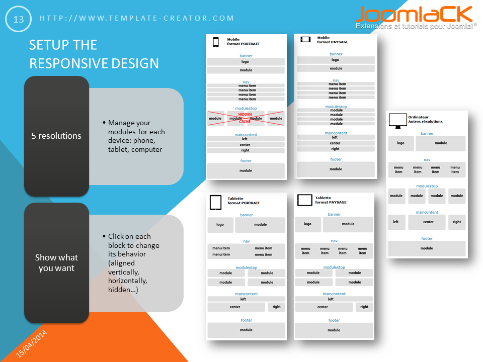
Set the responsive design for your Joomla! template
Template Creator CK allows you to manage the way your modules are shown into your Joomla! template in responsive design. For each device (phone and tablet in portrait and landscape orientation, and the computer) you can select how to show your modules : aligned in one row, vertically aligned, hidden...
Modules behavior into Template Creator CK
Go on the Responsive Design edition popup into Template Creator CK and click on each block to change it in the desired resolution.
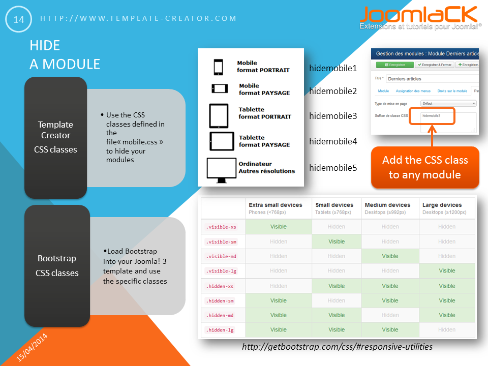
Hide a specific module into your Responsive Joomla! website
Edit any module of your website, in the advanced options >> Module CSS class suffix >> add the class you want to hide it on any screen resolution. If you are creating a joomla! 3 responsive template and you load Bootstrap, you can use the Bootstrap classes too.